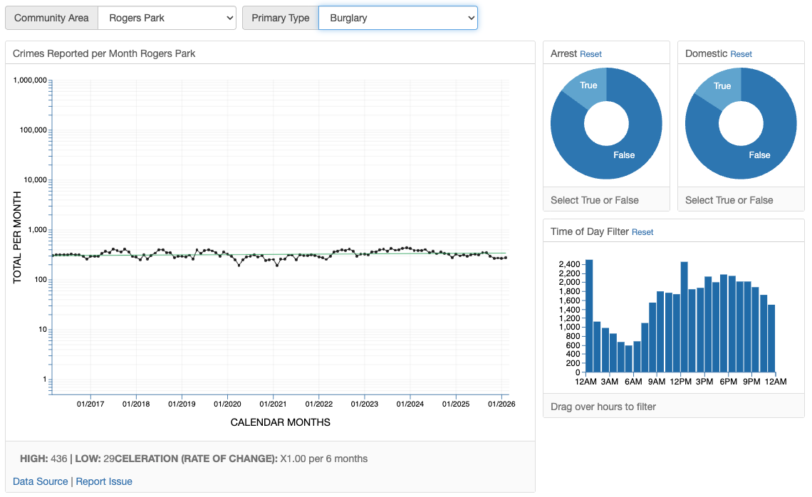
Identify patterns and trends in community data with interactive time series charts and statistical analysis.
Get contextual analysis and insights powered by AI to help understand what the data means for your community.
Filter and analyze data by multiple dimensions including location, time period, and categories.
Access all dashboards on any device with a fully responsive design optimized for mobile viewing.
ChartPeople is a team of volunteers from data sciences, behavioral psychology, technology development, and civic action fields. We share a common belief: our leaders must use data to drive better policy for all. We work to make data accessible, understandable, and actionable for communities.
We believe visualizations are tools for analysis, not tools for proving predetermined positions. We employ standard charting practices and methodologies when possible, prioritizing data clarity and intellectual honesty. Our goal is to advocate for better understanding through thoughtful visualization and transparent data exploration.
ChartPeople dashboards provide: